Showing posts with label posters. Show all posts

Thursday, May 28, 2009

Sidearm Design Posters


Some beautiful work by Washington based designer Karl Peterson of Sidearm Design. Kind of reminds me of the Pilot Report poster series I started a while back. I love his images! Hopefully he'll start selling some of them in his shop.

Monday, November 3, 2008

30 Reasons


"30 Reasons is a 30-day email and internet campaign to encourage people to vote for Barack Obama. Our goal is simple: Use design to build a logical, multi-faceted argument for Obama and make it easy to share each reason with another person."

"We enlisted 30 graphic designers to create a poster that represents a reason to vote for Obama. Starting on the October 5th, we will post a new poster online every day and email it to our list. Recipients can easily share the email with other supporters and friends who are undecided."


I thought this was an interesting project. Above is my favorite (graphically) by artist Andrio Abero. You can view the rest of the poster designs here.

Thursday, June 26, 2008

Pilot Report 003 Poster


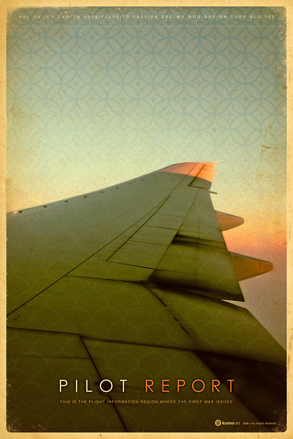
A third poster for the Pilot Report series. Photo was taken from above the Pacific Ocean while on my way to Japan back in 2004. So far I've only learned how to translate one thing from the pilot report located at the top of the poster. SK SKC means "clear skies". Interesting stuff, I might try and learn how to translate a whole PIREP so I can create my own for future designs.

Tuesday, June 3, 2008

Pilot Report 001 & 002 Posters


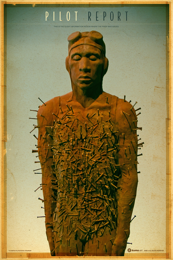
Since I've been using Adobe Photoshop CS3 a lot at work, I've been able to learn a good amount of tricks and techniques. I've decided I'm starting a line of 12x18 inch posters with the continuing title, Pilot Report. I'm going to try and use my photography in each one and find some sub copy that somehow relates to it. As you can see, the first poster has a photo I took in Kyoto, Japan (original picture). I was lucky enough to catch the plane flying at a slight angle in the distance, and I was pleasantly surprised when I snapped the text at an exact 15° angle and they lined up together perfectly! What are the chances?

But in case any of you haven't noticed, a lot of my inspiration for this comes from Scott Hansen's work. He just completely nailed a style that I fell in love with. So I'm using similar ideas that he has previously done and applying them to these.

I've uploaded and ordered one print from Snapfish and will report on the quality of the print when I receive it.

Update: I added a second one with a photograph I took of one of Roxanne Swentzell's pieces at the Brooklyn Museum. Unfortunately I forgot to write down what the name of it is. But I'll tell you one thing, I think Bodega Sans is a much more fitting font for the title Pilot Report.