Do you use Google Reader? Tired of that bland "Google" look? Head on over to Helvetireader.com to download a sweet helvetica theme for your reader! Also, since you can see my subscriptions now, now's a good time to ask you - What are YOU subscribed to? Have any recommendations?
I thought I hated it, but it's grown on me. Well, the new type at least. Still not digging the awful globe and it's 3D treatment. I spotted the new logo on a store front in the city today (pictured above) and was reminded of the original logo:
The whole idea of that negative spacing on the original is to indicate that it is indeed a sphere. Simple yet effective. Now take that image and actually make it a 3D ball with gradients and transparencies and you get something that defeats the whole purpose of the original design.
Yuck. Just another bubbly, Apple-ish 3D logo. It looks like it belongs on my applications dock. The perspective is all wrong and shouldn't the white be the transparent part? I thought the blue was the solid area. But anyways, whatever. Just thought it was interesting that if you strip away all the 3D treatment it really is nice looking, especially on that large copper sign.
Since the release of his latest album Just a Souvenir, Tom Jenkinson (AKA Squarepusher) has gone ahead and created this music video for Planet Gear, the 8th track on the album.
"The overall concept of this video revolves around images of imaginary astronomical phenomena. I selected a method which I anticipated would be appropriate to the construction of "scaleless" objects, such that one could imagine them occupying planetary sized volumes of space."
The new album is like nothing I've ever heard before. With carefully crafted layers of bubbling slap bass, complex (and erratic at times) jazz drumming, ultra-compressed distorted guitar riffs, vocoders and xylophones, glowing synth chimes and pads, time signature and bpm changes (that I still can't quite understand, which makes me like them even more), rock, prog-rock, punk, house, jungle, slow jams, reds, greens, colors, yellows, blues and purples, whites, GOOD LORD THE WHITES!!!
Okay I went a little over the top there, but you have to hear it to understand. There is no categorizing this album. Go give it a listen. That's an order not a suggestion.
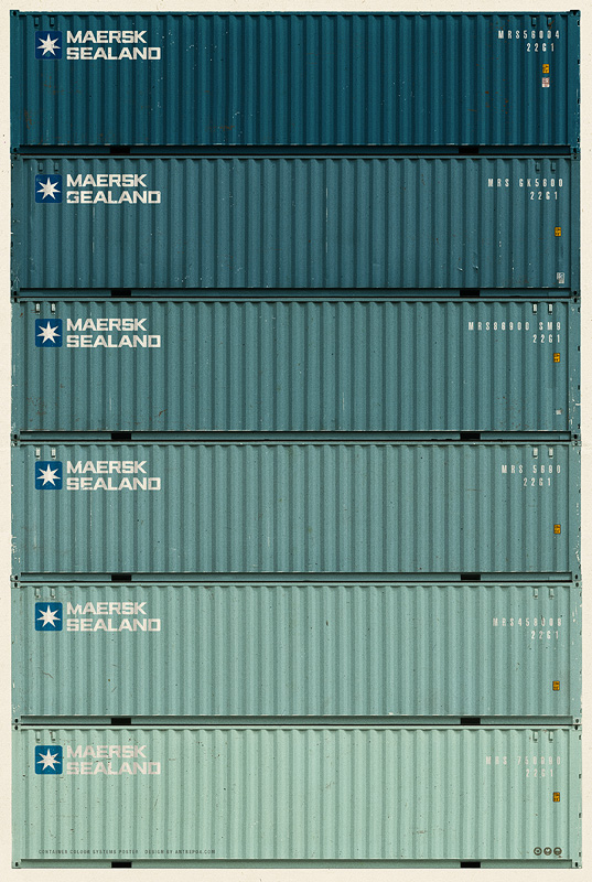
By Antrepo Design Industry. $100 for all five prints. 18.9x26.8". Huge posters. Definitely wall space available. Logos. Colors. Oh my god, the colors. Rolling over the ADD TO CART button. Somebody please stop me. Soo...aammaaazzii....