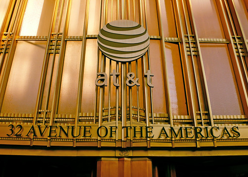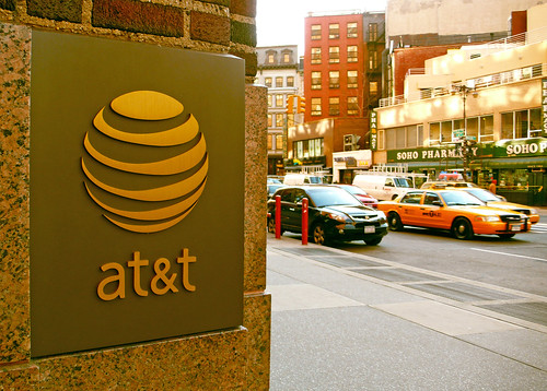

I thought I hated it, but it's grown on me. Well, the new type at least. Still not digging the awful globe and it's 3D treatment. I spotted the new logo on a store front in the city today (pictured above) and was reminded of the original logo:

The whole idea of that negative spacing on the original is to indicate that it is indeed a sphere. Simple yet effective. Now take that image and actually make it a 3D ball with gradients and transparencies and you get something that defeats the whole purpose of the original design.

Yuck. Just another bubbly, Apple-ish 3D logo. It looks like it belongs on my applications dock. The perspective is all wrong and shouldn't the white be the transparent part? I thought the blue was the solid area. But anyways, whatever. Just thought it was interesting that if you strip away all the 3D treatment it really is nice looking, especially on that large copper sign.


2 comments:
yo that 3d look is played OUT, i know you love that retro vector look to stuff. its pretty cool
haha. love the humor
Post a Comment