I just ate lunch about an hour ago. Saw these. Now I'm hungry again! These extraordinary oil paintings (yeah, I know. PAINTINGS!) are by Atlantan artist James Neil Hollingsworth. I love how there are no settings. It's just the food sitting there in dark spaces. All your focus is drawn to the realism of the cookie part of the oreo or the glimmering jelly in that PB&J. You can view the rest of his work here where he has a diverse array of subject matter (the food just happens to be my favorite).
Here are a couple new drawings from lasts week long pose session at Spring Studio in Soho. Our model was so serious the whole time. Almost angry. But his face was so fun to sketch. Such character. The top two (one's a close-up) were the long pose (about 80 minutes with a couple breaks). The second I think was 15 minutes and the last was 5. I'm thinking about bringing in ink and brushes for the next session. I want to start creating pieces that are wall-worthy for my apartment.
Some nice work by Barcelona-based design company Hey Studio. Would love it if they sold these as small prints.
On a side note, I finally started going back to Spring Studio and have some drawings i'd like to scan and share. I'll try and have them up later this week.
It's been a few months since I've attended a drawing session at Spring Studio. Motivation hasn't been so high lately when it comes to illustration I guess you can say. Above is exactly what I needed to see though. An artist who is so good my mind is racing with inspiration and creativity. I can seriously feel every texture this guy paints or draws. So beautiful. You can view the rest of his work here.
It turns out he's having a solo exhibition right here in NYC as stated in his blog. I will definitely try and make the opening on March 12th. Can't wait.
I've decided to create a label named "Over A Month - No Posts". This way if you'd like to locate the first posts after each of my long, lazy blog breaks, well then you're just one click away. I'm going to go ahead and put all the blame on the cold weather which has sort of taken the fun out of going out on photo adventures. But this blog wasn't created for the sole purpose of posting your photography, Kyle! What happened to the album reviews, ikebana lessons, and drawings!? GIVE US MORE TILT-SHIFTS!!! Whoa, jeez. Stop yelling at myself, self.
Above are some '08 pictures I've uploaded recently to Flickr that I had forgotten were on my camera. Hopefully you will hear from me again within the next thirty days. Ciao.
Do you use Google Reader? Tired of that bland "Google" look? Head on over to Helvetireader.com to download a sweet helvetica theme for your reader! Also, since you can see my subscriptions now, now's a good time to ask you - What are YOU subscribed to? Have any recommendations?
I thought I hated it, but it's grown on me. Well, the new type at least. Still not digging the awful globe and it's 3D treatment. I spotted the new logo on a store front in the city today (pictured above) and was reminded of the original logo:
The whole idea of that negative spacing on the original is to indicate that it is indeed a sphere. Simple yet effective. Now take that image and actually make it a 3D ball with gradients and transparencies and you get something that defeats the whole purpose of the original design.
Yuck. Just another bubbly, Apple-ish 3D logo. It looks like it belongs on my applications dock. The perspective is all wrong and shouldn't the white be the transparent part? I thought the blue was the solid area. But anyways, whatever. Just thought it was interesting that if you strip away all the 3D treatment it really is nice looking, especially on that large copper sign.
Since the release of his latest album Just a Souvenir, Tom Jenkinson (AKA Squarepusher) has gone ahead and created this music video for Planet Gear, the 8th track on the album.
"The overall concept of this video revolves around images of imaginary astronomical phenomena. I selected a method which I anticipated would be appropriate to the construction of "scaleless" objects, such that one could imagine them occupying planetary sized volumes of space."
The new album is like nothing I've ever heard before. With carefully crafted layers of bubbling slap bass, complex (and erratic at times) jazz drumming, ultra-compressed distorted guitar riffs, vocoders and xylophones, glowing synth chimes and pads, time signature and bpm changes (that I still can't quite understand, which makes me like them even more), rock, prog-rock, punk, house, jungle, slow jams, reds, greens, colors, yellows, blues and purples, whites, GOOD LORD THE WHITES!!!
Okay I went a little over the top there, but you have to hear it to understand. There is no categorizing this album. Go give it a listen. That's an order not a suggestion.
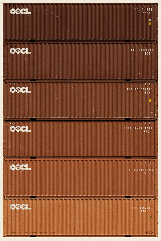
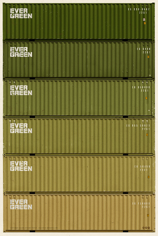
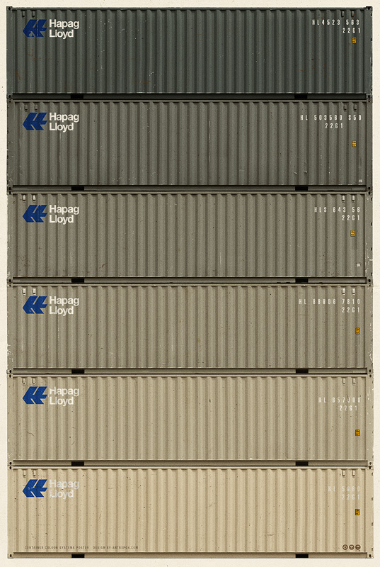
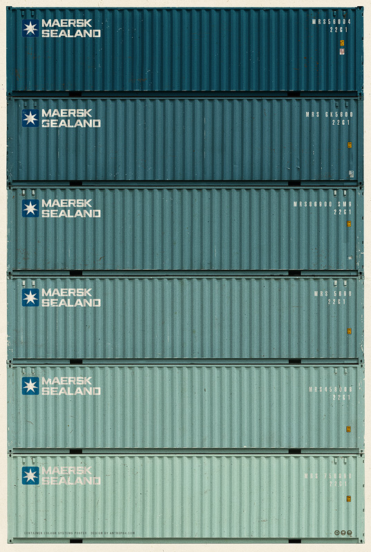
By Antrepo Design Industry. $100 for all five prints. 18.9x26.8". Huge posters. Definitely wall space available. Logos. Colors. Oh my god, the colors. Rolling over the ADD TO CART button. Somebody please stop me. Soo...aammaaazzii....
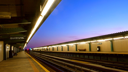
LIFE and Google have come together and created a HUGE photo archive (10 million scanned photos) spanning from the 1750's to today. Apparently 95% of these have never been seen before! Above are a few photos I liked from my keyword search "plane". You can start by clicking here or by adding "source:life" to any Google image search.
Happy searching!
EDIT: Seriously, what's up with that third photo? It looks like he's flying a missile or something. And the lit up cockpit, it's just such a wicked picture.