Monday, June 30, 2008
David Byrne - Playing the Building
I forgot to post this earlier, but I ended up checking out David Byrne's grand installation, Playing the Building, at The Battery Maritime Building.
"Creative Time presents Playing the building, a sound installation in which the infrastructure, the physical plant of the building, is converted into a giant musical instrument. Devices are attached to the building structure — to the metal beams and pillars, the heating pipes, the water pipes — and are used to make these things produce sound. The activations are of three types: wind, vibration, striking. The devices do not produce sound themselves, but they cause the building elements to vibrate, resonate and oscillate so that the building itself becomes a very large musical instrument."
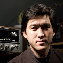
I went with my friend Jonah and we ended up seeing Byrne just hanging out in the corner of the room! The installation itself was pretty neat. It was a bit frustrating trying to play some sort of rhythmic arrangement since the actual sounds produced by striking the keys were delayed a second or two. And since there was a line to sit down and try the instrument, I felt rushed. Probably only played it for 45 seconds or so.
I suggest that you go see it though if you're in NYC. It's open until August 24th.
Thursday, June 26, 2008
Pilot Report 003 Poster
A third poster for the Pilot Report series. Photo was taken from above the Pacific Ocean while on my way to Japan back in 2004. So far I've only learned how to translate one thing from the pilot report located at the top of the poster. SK SKC means "clear skies". Interesting stuff, I might try and learn how to translate a whole PIREP so I can create my own for future designs.
Tuesday, June 3, 2008
Pilot Report 001 & 002 Posters
Since I've been using Adobe Photoshop CS3 a lot at work, I've been able to learn a good amount of tricks and techniques. I've decided I'm starting a line of 12x18 inch posters with the continuing title, Pilot Report. I'm going to try and use my photography in each one and find some sub copy that somehow relates to it. As you can see, the first poster has a photo I took in Kyoto, Japan (original picture). I was lucky enough to catch the plane flying at a slight angle in the distance, and I was pleasantly surprised when I snapped the text at an exact 15° angle and they lined up together perfectly! What are the chances?
But in case any of you haven't noticed, a lot of my inspiration for this comes from Scott Hansen's work. He just completely nailed a style that I fell in love with. So I'm using similar ideas that he has previously done and applying them to these.
I've uploaded and ordered one print from Snapfish and will report on the quality of the print when I receive it.
Update: I added a second one with a photograph I took of one of Roxanne Swentzell's pieces at the Brooklyn Museum. Unfortunately I forgot to write down what the name of it is. But I'll tell you one thing, I think Bodega Sans is a much more fitting font for the title Pilot Report.
Subscribe to:
Posts (Atom)